Canvas Student is an application by the company Instructure that serves as a learning management platform. Instructure’s claim is to enhance the teacher student connection rather than just focus on faculty accessibility and features like most other learning management platforms. Students login using their school credentials to access a personal dashboard and navigate to all available material a teacher provides for the course.
Unfortunately, students who attend more than one school can't view or access all coursework from all schools in one single login instance. They first must logout/switch users, and only then the student is prompted to login with the other desired school's credentials to view its corresponding material
No solution is as simple as it may seem, and most of the time it's coupled with a caveat or requires some sort of sacrifices. For Canvas these are some of the following things I had to keep in mind
Design an efficient solution that allows students who attend multiple schools view their coursework from any school without having to log in and out from multiple accounts all while not disrupting the user flow of students who only attend one school
Using instagram and Reddit, I asked both communities to share an app or website they find frustrating when using. Here are the results from a total of 38 responses
Canvas received the most votes in the previous poll. For this reason, I sent out another poll to those specific users who voted Canvas and simply asked….What do you find frustrating about Canvas specifically?
Lastly, I held some one-on-one interviews with students who currently were frustrated with lack of multiple school compatibility to really empathize with their pain point
Q ) On which platform do you use canvas more, mobile or desktop and why?
A ) Mobile, because it’s a quicker process to view coursework and grades at any time.
Q ) What is the most frustrating part of the way canvas currently handles multiple schools?
A ) Having to log in and out each time to access individual school material instead of complete access under one instance of a login. It is so unfortunate something important as academics must experience these limitations
Q ) If this solution meant certain features needed to be moved or placed on a different area of the app, what is one thing you wish to remain constant?
A ) School material to still be easily accessible, and for each course to retain its specific settings
As a final way to empathize with users, I spent a large amount of time just flipping through the app and experienced how inconvenient it was too logout so I can view grades, announcements and homework for another school. In addition, this amount of time allowed me to familiarize myself with Canvas's design system.
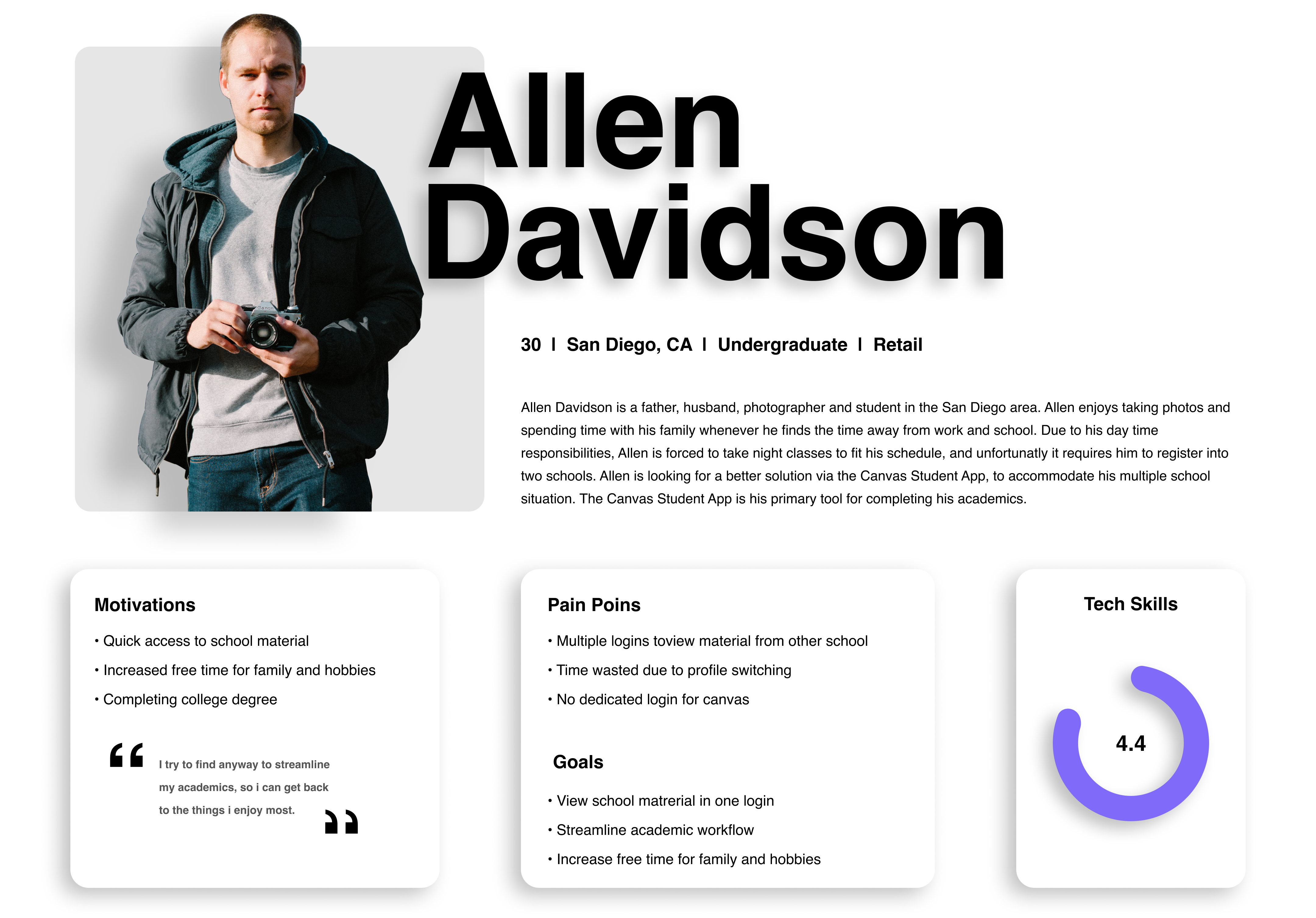
Alright, I got to know Allen, I have a good idea of what he wants, so now what's the plan? First, I wanted to make sure the journey Allen would have to take was broken down into feasible segments. The result of a broken down flow, allowed me to treat each segment as an individual screen to design. Most importantly, my plan was to receive the most feedback while designing the least amount possible so that at the point of starting HI-FI frames, I was certain what each screen would look like and how it should respond to Allen's interactions.

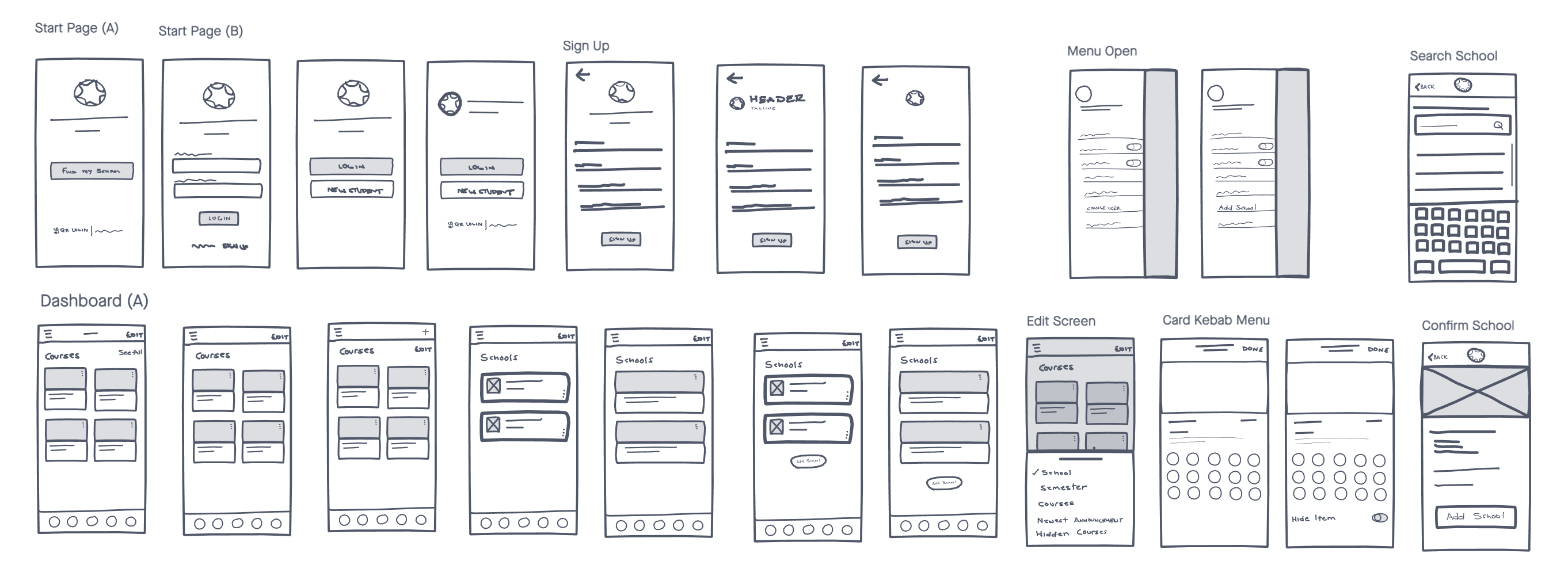
Although the crux of this project was to design a solution so a student can view material from another school without logging in and out, I soon realized this new design would introduce new components, while some existing components needed to change altogether. The main challenge of course was to present something new, yet a current user would not feel their familiar experience has been compromised. Ultimately, the entire solution can be displayed through a total of 5 screens. Below I explain the 5 screens in further detail
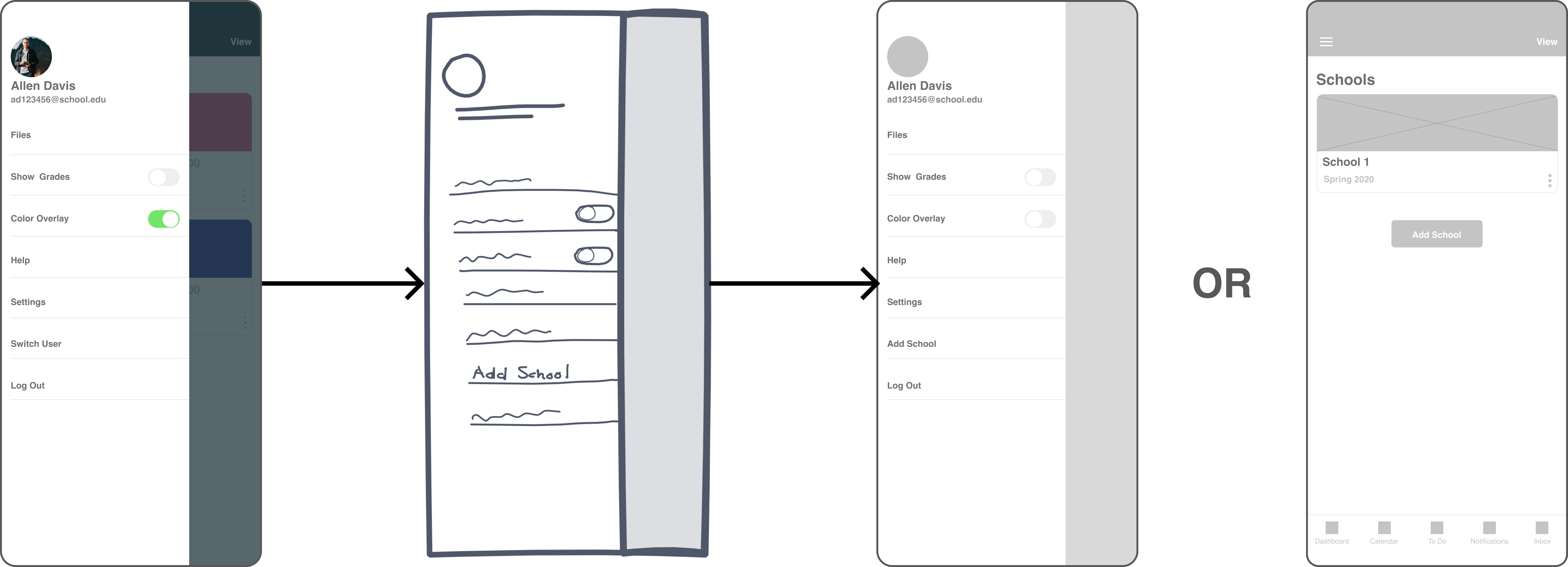
Two ways to add a school
Previously, a student could view coursework from a different school by logging out of canvas, then logging back into canvas with another school's credentials. This was achievable by accessing the "Switch User" option found in the menu.
Now, the quickest way to add a second school is simply pressing the new "Add School" button found at the center of the dashboard right under the student's courses.
Likewise an alternate way is the new "Add School" option which has replaced "Switch User" in the menu.
Don't just view coursework
Since Canvas Student didn't have multiple school functionality under one login, there was no need for any other viewing options other than the coursework from your ONE school. Before, all a student had was a button "See All" which would display all courses taken for the one school.
Now, the "See All" button has simply been renamed to "View" which grants a student to view and curate dashboard content by schools, semesters, coursework from multiple schools and not just one. The "View" button is now located at the top right corner of the dashboard screen, replacing the "Edit" button which I will explain next....
Just toggle now
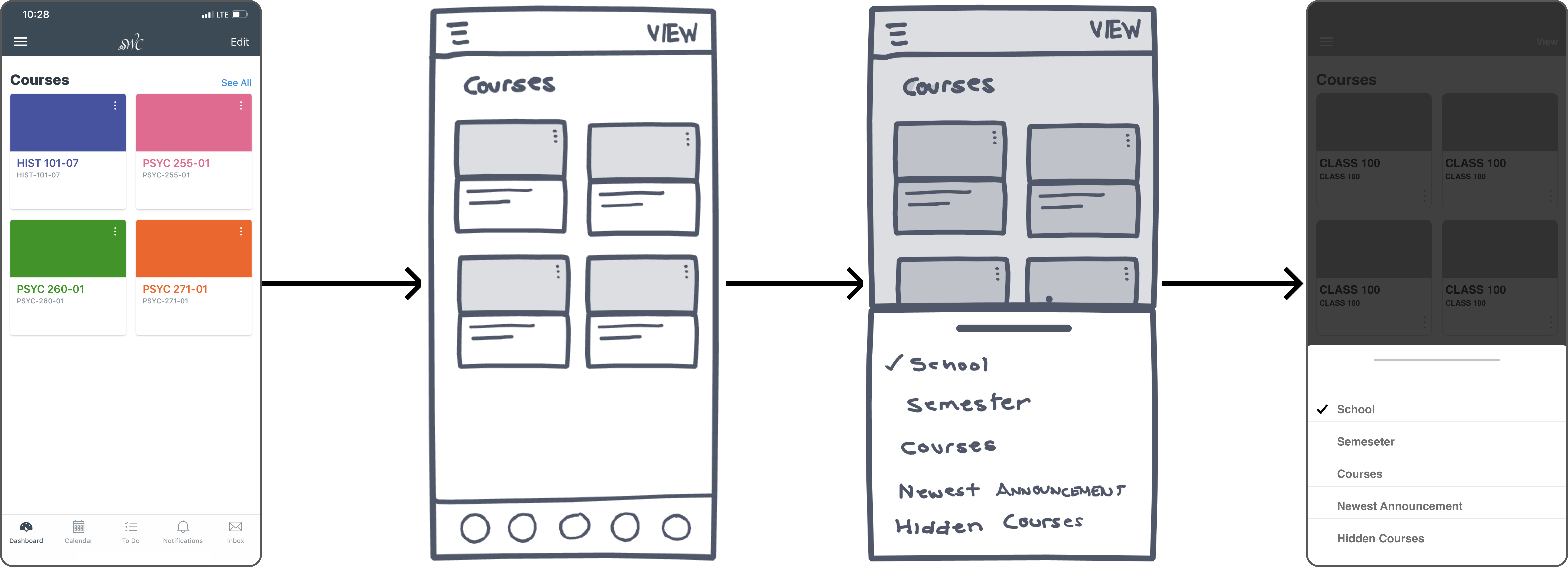
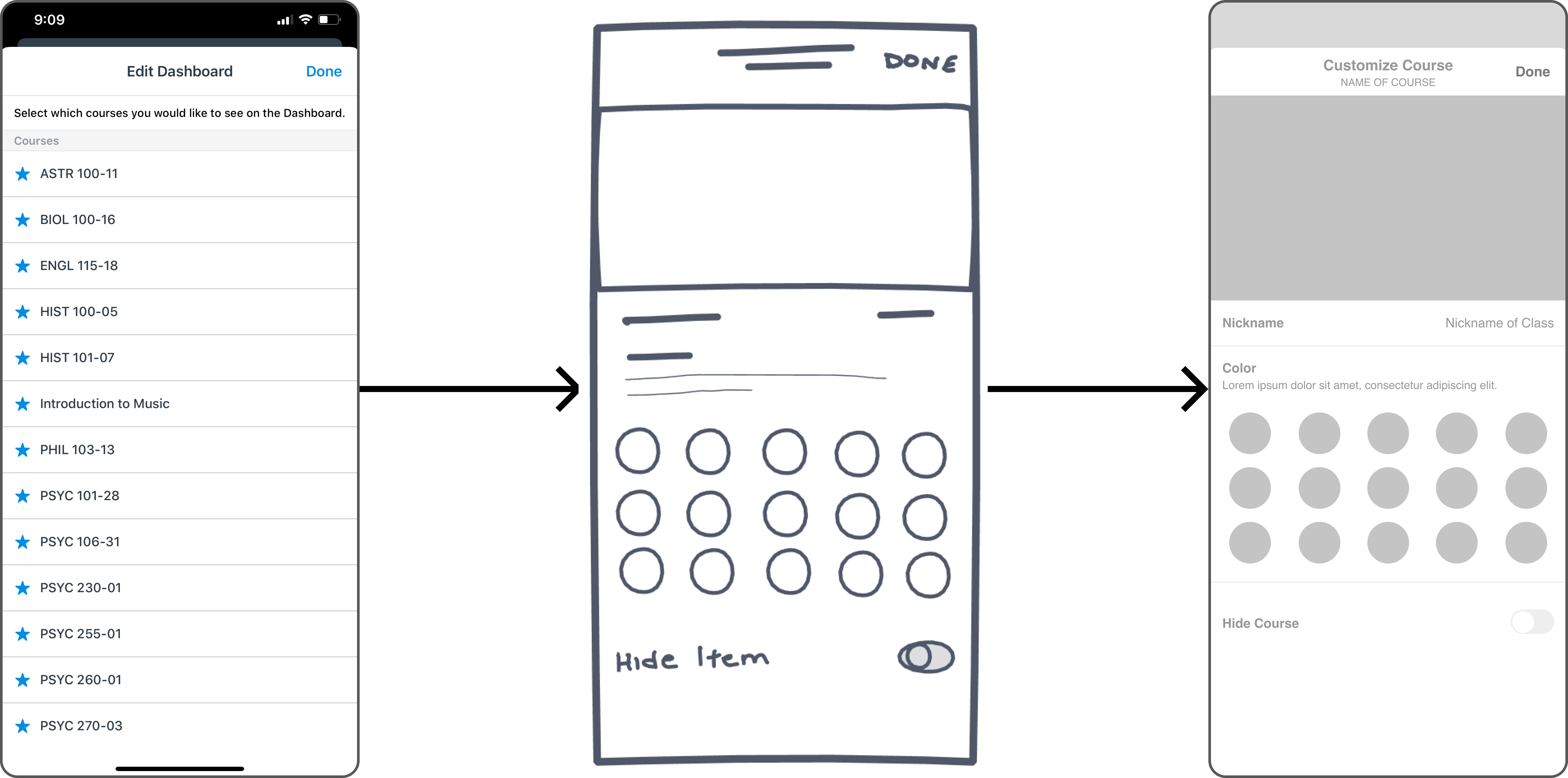
Canvas granted students to hide courses they didn't want listed on their dashboard by pressing the "Edit" button found at the top right corner of the dashboard. When pressed, a list of all courses, both past and present, are displayed with a star next to them. To hide a course a student had to click the star. Unfortunately, many of the users I interviewed had no idea what the edit menu did, and some others didn't even know it was there. Ok but wait...if the "View" button is now located where the "Edit" button was, where can a student go to hide a course?
Just so happens every course found on the dashboard had its own settings via the Kebab Menu. Now a student can simply scroll to the bottom, and just toggle the "Hide Course" switch. That's all.
Yep that's my school
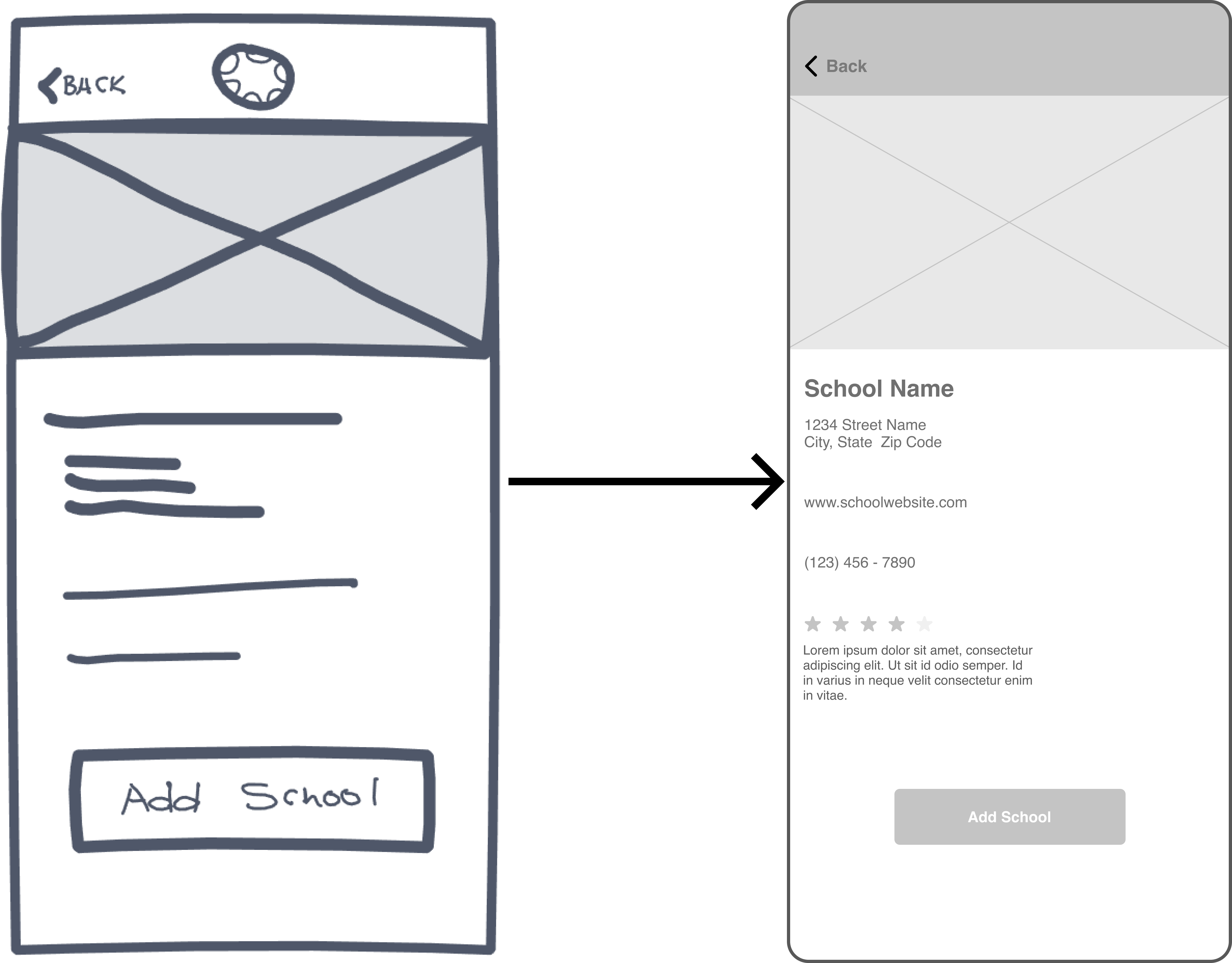
This was an added bonus and not really crucial to the design solution. But, this menu felt like it was needed. For example, once a student logged out and searched for the school they wanted to access, they were abruptly redirected to their school's login portal. As a matter of fact, some students found that to be a bit "weird" and others found it frustrating when they would accidentally tap on the wrong school.
So why this screen? Simply, it serves as an informative confirmation buffer. If students accidentally select the wrong school, they can easily go back without a redirect to the wrong school. Or, students can be reassured they are adding the correct school by confirming the provided information.
After strategic sketch selections and design decisions, it was time to create wireframes to better represent the information. Below is a set of wireframes illustrating a student's journey to adding a second school to their dashboard
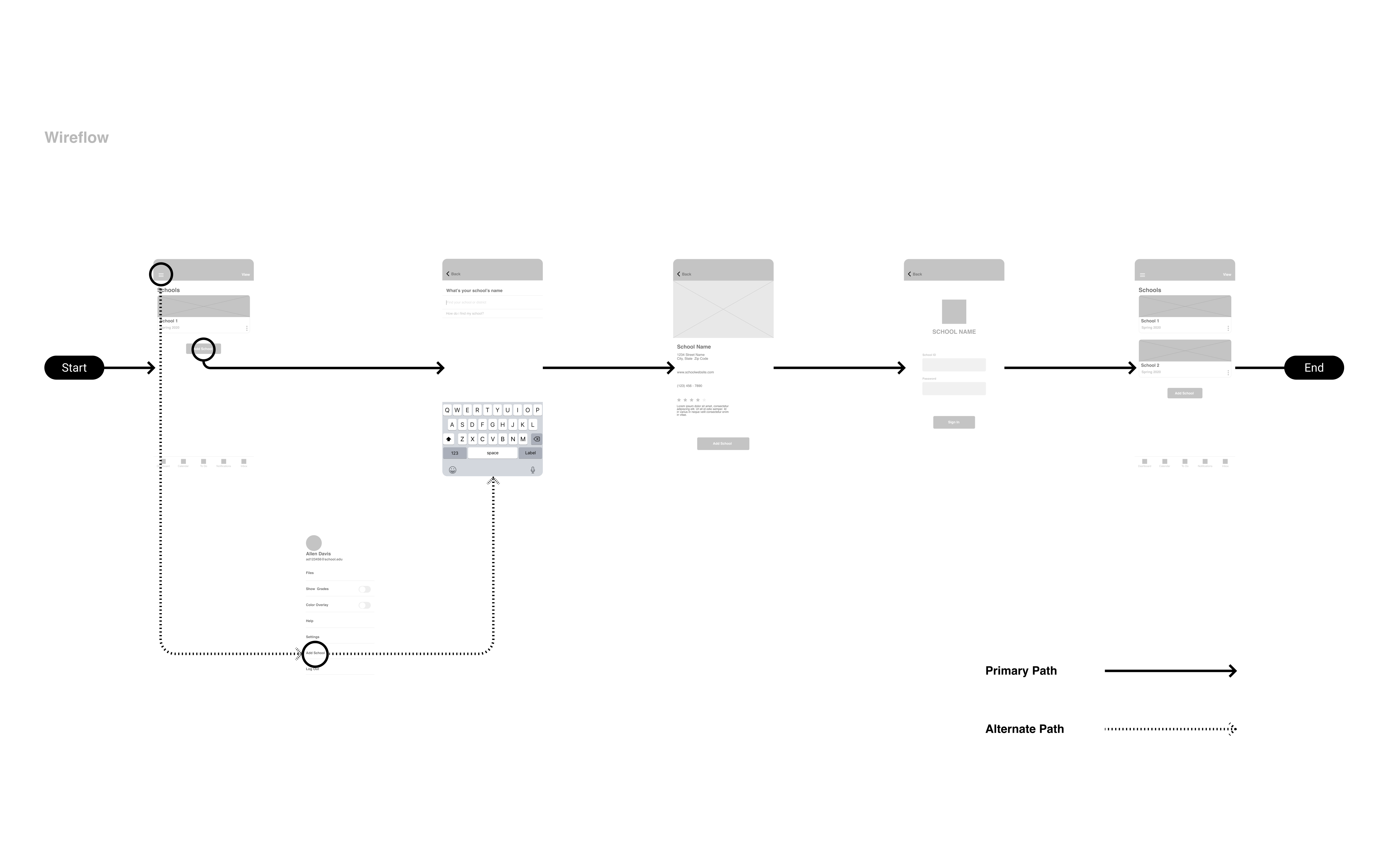
Using this same user flow above as a template, I conducted usability tests with 3 different users. I asked them to complete the same task of adding a second school. These tests were conducted using the wireframes and nothing high fidelity. I believed it would be a great indication of a solid user experience, if the users could complete the task with just bare bone visuals. Here is a snippet from the post test questions
Q ) How would you describe your experience with the new solution for adding a second school?
A ) Really simple and easy, was completely user friendly and not confusing
Q ) What was your overall impression with the newly improved Canvas Student App?
A ) Extremely grateful, this makes life easier as a current student
Q ) What was the best new feature?
A ) The add school button located at the center of the dashboard
Conducting usability testing really brought forth a great amount of insightful feedback. Additionally, Allen was pleasantly surprised and excited with the new design solutions to be made. With Allen's approval, I was given the green light to start high fidelity designs. Let's take a look at the new and improved Canvas

I conducted one final interview simply asking Canvas Users if these new additions negatively impacted their workflow or familiarity.
The resounding answer was NO. Some couldn't believe the students with multiple schools had to put up with this lack of functionality, and were grateful for this new feature as some were going to be cross enrolling at a secondary school next semester.
In regards to next steps, there are two ideas in the forefront. First, these new additions are to be implemented for desktop and not just mobile. Second, design Canvas to have its own login rather than logging in by searching for a school.
To start off, I should mention how much I learned conducting this case study, and the most important thing I learned was the importance of not getting ahead of the project and hurrying to play with design tools. As mentioned, this is why I made a separate personal goal to design as little as possible, and focus more on research and testing. Due to this strategy, visual design was very easy.
In light of that success there are things I would do different. For example, I would gear the user research interview questions towards a more specific subject. In other words, I would ask about specific potential app features, rather than generic open ended questions. Yet, due to the nature of this project, the strategy that took place was helpful and effective.
Canvas Student serves as a Learning Management System (LMS) that enables students to get a realistic bridging between the teacher and student relationship. Students can access all the required material a teacher provides with nothing but a few quick and easy button presses. Canvas's whole approach is to help students obtain academic success by mitigating any obstacles that try to get in the way of that goal. With these new design additions, issues and obstacles that were true for students who had multiple schools have now been ironed out and a new streamlined approach has been presented. Onto the next challenge......